

Every insurance KPI dashboard needs several key numbers visible without a single click: loss ratio, combined ratio, premium trend, retention rate, and claim cycle time. These metrics tell you whether underwriting is profitable, whether growth is real or borrowed against future losses, and whether customers are staying. The rest of this guide covers the formulas behind each core metric, department-specific KPI sets for claims, underwriting, sales, and finance, dashboard layout rules, data source integration, and benchmark targets.
TL;DR:
- Most insurance KPIs should be reported daily or weekly for operational metrics, while financial ratios like ROE and solvency are better suited to quarterly updates.
- Critical KPIs such as loss ratio, combined ratio, and retention rate must be segmented by product line, region, and channel to reveal specific underperforming segments.
- Dashboard layout should prioritize a few high-level indicators at the top with drilldowns and segment filters, avoiding overload that causes decision fatigue.
- Clear ownership, action plans, and a metric contract are essential to ensure KPIs remain meaningful and drive appropriate responses over time.
- Incorporating predictive metrics like fraud indicators or churn scores can provide early warning signals, but only if fed with reliable, timestamped event data from integrated CRM and operational systems.
Table of Contents
- What Core KPIs Belong on an Insurance Analytics Dashboard?
- Which KPIs Matter Most by Department?
- How Do You Prioritize KPIs Without Drowning the Team?
- How Should an Insurance KPI Dashboard Be Laid Out?
- What Benchmarks and Cadence Should You Use?
- How CallBack CRM Playbooks Turn CRM Events Into Dashboard-Ready KPIs
- What Do Real Insurance KPI Dashboards Actually Look Like?
- What Goes Wrong When Teams Build Insurance Dashboards?
- What Predictive and Advanced KPIs Belong on an Insurance Dashboard?
- Why Dashboard Culture Matters More Than Dashboard Design
- Turn Every Lead and Quote Into a Dashboard-Ready Signal
- Where to Go for KPI Formulas, Benchmarks, and Templates
- Sources
What Core KPIs Belong on an Insurance Analytics Dashboard?
A dashboard earns its place on someone’s desktop only when the numbers on it map to decisions someone actually makes. Below is the KPI library that shows up on almost every functioning insurance performance dashboard, along with the formula, where to segment it, and the question it should trigger when it moves.
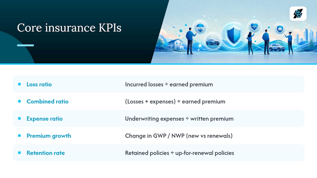
Loss ratio measures claims paid against premium earned: incurred losses divided by earned premium. It’s the primary indicator of underwriting effectiveness and should always be segmented by product line, distribution channel, and geographic region, because a healthy blended number can hide a bleeding segment underneath it. Diagnostic question: did the ratio move because of claim frequency, severity, or a pricing miss on a specific product?
Combined ratio adds the expense ratio to the loss ratio (losses plus expenses, divided by earned premium). A result under 100% signals an underwriting profit before investment income; above 100% means the underwriting book alone is losing money. Segment by line of business. Diagnostic question: is the deterioration coming from claims or from operating costs?
Expense ratio is underwriting expenses divided by written premium. It’s the lever finance teams pull first because it responds faster to cost-cutting than loss ratio does. Diagnostic question: is the increase from acquisition cost, overhead, or commission structure?
Premium growth (gross written premium and net written premium) tracks new and renewed premium before and after reinsurance. GWP growth without matching NWP growth often means reinsurance costs are eating the gain. Segment by channel and producer. Diagnostic question: is growth coming from new business, rate increases, or retention, and is it profitable growth?
Retention rate is retained policies divided by policies up for renewal, and it deserves early priority because it’s one of the more stable predictors of book health, alongside solvency ratio, according to KPI Depot’s benchmark guidance. Diagnostic question: is attrition concentrated in one segment, price band, or producer?
Claims frequency and severity track the count of claims per exposure unit and the average cost per claim. These two numbers, read together, tell you whether loss ratio moved because more people are filing or because claims are getting more expensive.
Claim cycle time is the average days from first notice of loss to closure. Faster cycle time usually correlates with higher customer satisfaction and lower loss adjustment expense.
Quote-to-bind ratio measures bound policies divided by quotes issued, a critical customer-lifecycle metric that reflects pricing competitiveness and service speed. Segment by producer and channel to find where quotes are dying in the funnel.
Customer acquisition cost (CAC) divides total sales and marketing spend by new policies bound. Track it by channel; a channel with low volume but low CAC may deserve more budget than a high-volume channel bleeding money per policy.
Net Promoter Score (NPS) gauges likelihood to recommend, typically surveyed post-claim or post-renewal.
Return on equity (ROE) and investment yield round out the financial picture for finance and executive audiences.
A few of these are leading indicators (quote-to-bind, claims frequency, NPS) that predict where the lagging numbers (loss ratio, combined ratio, retention) will land next quarter. Report claims-adjacent metrics daily or weekly; report underwriting and financial ratios monthly, since FP&A guidance ties cadence directly to how volatile each metric is.
Which KPIs Matter Most by Department?
A combined ratio matters enormously to a CFO and means almost nothing to a claims adjuster closing files. Every department needs its own short list, pulled from the same underlying data, so nobody drowns in numbers meant for someone else’s job.
Claims team
- Cycle time from first notice of loss to closure
- Time to first contact with the claimant
- Cost per claim (loss adjustment expense included)
- Leakage indicators (overpayment or underpayment against expected reserve)
- Customer satisfaction score at claim close
Underwriting team
- Quote-to-bind ratio by segment
- Hit rate (bound business divided by total submissions)
- Loss ratio by product line and risk tier
- Average decision time on new submissions
- Underwriting leakage (deviations from pricing guidelines)
Sales and agency team
- New business premium written
- Quote-to-bind conversion rate
- Average policy size
- Renewal pipeline value and timing
- Producer-level KPIs: activity volume, close rate, book profitability
Finance and executive team
- Combined ratio and its two components
- Solvency ratio
- Return on equity
- Expense ratio trend
- Premium growth trend (GWP and NWP)
Operations and data team
- Data completeness rate across policy, claims, and billing feeds
- Queue aging for pending transactions
- Rework rate (transactions requiring manual correction)
- Integration uptime and health checks
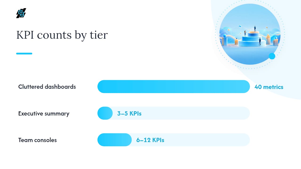
Insiders working with tiered KPI architecture put these into three layers: executive dashboards carrying three to five KPIs, manager dashboards with six to twelve, and investigative pages that hold raw event logs for root-cause work. That structure keeps a claims manager from being handed the same view as a board member, which is one of the more common reasons dashboards go unused after the first month.
How Do You Prioritize KPIs Without Drowning the Team?
Most failed dashboards don’t fail from lack of data. They fail because someone put forty metrics on one screen and nobody knew which three actually needed attention today. Prioritization means running every candidate KPI through a short filter before it earns a spot.
- Link it to a strategic outcome. If a metric doesn’t connect to profitability, growth, retention, or compliance, it’s noise, regardless of how easy it is to calculate.
- Favor leading indicators when you can get them. Quote-to-bind and claims frequency move before loss ratio does. A dashboard full of lagging metrics tells you what already happened, not what to fix now.
- Assign an owner and a required action. Every KPI on the dashboard needs a name attached and a defined response when it crosses a threshold. A metric nobody owns gets ignored the first time it dips.
- Set cadence based on volatility, not habit. Claims operational metrics can shift hourly; solvency ratio barely moves month to month. Reporting both on the same weekly schedule wastes attention on one and starves the other.
Once the filter runs, organize the output into tiers: an executive summary with three to five KPIs, team consoles with six to twelve, and investigative pages for analysts drilling into cohorts and raw events. Industry guidance is consistent on this point: a tiered structure prevents the decision fatigue that flat, sprawling dashboards create.
Metric hygiene matters as much as selection. Standardize formulas across teams so “loss ratio” means the same calculation in claims and in finance. Define cohorts (new business vs. renewal, by underwriting year) before anyone starts comparing numbers across them.
Pro Tip: Before adding any KPI to the dashboard, write down the exact action someone will take when it crosses a threshold. If you can’t name the action, the KPI isn’t ready for the dashboard yet, it’s ready for a spreadsheet.
How Should an Insurance KPI Dashboard Be Laid Out?
Layout decides whether a dashboard gets opened twice a day or once a quarter. The top row should hold a one-line executive summary, the numbers a manager glances at before a meeting starts, not the numbers that require explanation.
Below that, two or three drilldown panels let a viewer click from the summary into specifics, like loss ratio by product line or claim cycle time by adjuster. Segment filters (product, channel, producer, region) should sit at the top of the screen, not buried in a settings menu.
Widget choice matters more than most teams assume:
- Trend sparklines for anything tracked over time, so a viewer sees direction at a glance.
- Current-vs-target bars for KPIs with a defined benchmark, like combined ratio against 100%.
- Distribution charts for severity data, where averages hide the outliers that actually drive cost.
- Cohort tables for retention and quote-to-bind, broken out by underwriting year or acquisition channel.
Alerting needs restraint. Define thresholds with severity levels (watch, warning, critical) rather than a single trigger point, and attach a short automated note explaining why the alert fired. Teams that alert on every fluctuation train themselves to ignore alerts entirely, a pattern usually called alarm fatigue.
Device matters too. Mobile widgets should condense to the top-line KPIs a producer or claims manager checks between meetings; the full drilldown console belongs on desktop. A community-built insurance dashboard that combines leads, average premiums, conversions, and regional claims patterns is a useful reference for how much detail a single screen can hold without becoming unreadable.
What Benchmarks and Cadence Should You Use?
Reporting frequency should track how fast a number can hurt you. Claims operational metrics need real-time or daily visibility. Underwriting and sales metrics work fine on a weekly or monthly cycle. Solvency and investment metrics move slowly enough that quarterly review is appropriate, a cadence pattern FP&A guidance backs directly.
- Combined ratio under 100% signals an underwriting profit before investment returns; above 100% means the book depends on investment income to stay in the black.
- Loss ratio benchmarks vary heavily by line, which is why absolute targets mislead. Percentile benchmarks against similar books, the approach KPI Depot’s benchmark library uses, give a fairer read than a fixed number pulled from a different market.
- Escalate immediately when claims cycle time spikes or fraud indicators trip a threshold. Save scheduled quarterly review for solvency and investment yield, where day-to-day noise doesn’t mean much.
How CallBack CRM Playbooks Turn CRM Events Into Dashboard-Ready KPIs
Quote-to-bind and CAC are only as accurate as the events feeding them. Instrumenting the full funnel, lead captured, quote issued, policy bound, with timestamps at each stage, is what makes cycle time and true CAC per producer calculable at all. Without event-level data, both metrics are guesses dressed up as numbers.
CallBack CRM’s automated lead workflows tag each touchpoint as it happens, cutting the manual data entry lag that usually delays reporting by days. Automated tagging and webhook triggers push clean, timestamped events out to reporting tools instead of leaving them buried in an agent’s inbox.
- Lead capture events tag source and channel automatically, feeding CAC-by-channel calculations.
- Quote and bind events timestamp automatically, feeding quote-to-bind and cycle time.
- Renewal reminders and follow-up workflows feed retention tracking without manual list-building.
For agencies mapping their own sales funnel to dashboard events, this instrumentation step usually matters more than the dashboard software itself.
What Do Real Insurance KPI Dashboards Actually Look Like?
Most working examples share a similar shape: a top strip of four or five headline numbers, a regional or product breakdown beneath it, and a trend chart tracking the last twelve months. The community-shared insurance performance dashboard built for a general audience combines leads, average premiums, conversion rates, regional performance, and claims patterns into one screen, a template worth studying even if your book of business looks nothing like the example data.
A claims-focused version usually swaps the lead funnel for cycle time trends broken down by adjuster and region, with a severity distribution chart sitting next to the average cost figure so outliers don’t hide inside a misleadingly calm average. An underwriting version leans on hit rate and loss ratio by segment, often paired with a decision-time histogram.
Agencies building their first dashboard don’t need to reinvent this. Pulling a public template and swapping in your own KPI definitions, formulas, and thresholds gets you further, faster, than designing from a blank canvas. The value isn’t in the visual polish. It’s in whether the layout survives contact with a Monday morning claims meeting or an underwriting review, where someone needs an answer in under thirty seconds or the dashboard gets closed and ignored.
What Goes Wrong When Teams Build Insurance Dashboards?
The most common failure isn’t technical. It’s organizational: nobody agreed on what “loss ratio” means before building started, so claims calculates it one way and finance calculates it another. Six months later, two departments are arguing over numbers that were never comparable in the first place.
Metric overload is the second failure. A dashboard with forty tiles looks impressive in a demo and gets ignored within a week, because nobody can tell which number needs attention right now. The fix is the tiered structure covered earlier: a tight executive view, broader team consoles, and investigative pages for analysts who need the raw detail.
Data latency causes the third common breakdown. If claims data updates nightly but the sales funnel updates in real time, managers start distrusting the whole dashboard the first time the numbers seem to contradict each other. Matching refresh cadence to how the data actually gets used, not defaulting everything to “as fast as possible,” avoids this.
Ownership gaps round out the list. A KPI without a named owner degrades quietly. Nobody notices the formula drifted, or that a threshold was set two years ago and never revisited, until the number stops meaning anything useful. Assigning an owner to every metric at build time, and reviewing that ownership annually, catches most of this before it becomes a crisis.
What Predictive and Advanced KPIs Belong on an Insurance Dashboard?
Traditional KPIs describe what already happened. Predictive KPIs try to flag what’s about to happen, and a growing number of carriers and agencies are adding them alongside the standard metrics rather than instead of them.
Fraud detection indicators flag claims with unusual patterns: rapid claim filing after policy inception, claim amounts clustered suspiciously close to coverage limits, or repeat claimants across unrelated policies. These indicators don’t replace investigator judgment, they narrow the pool an investigator looks at first.
Risk scoring models rank policies or applicants by predicted loss likelihood, often blending traditional underwriting variables with external data sources. A rising average risk score across a book, even before loss ratio moves, is often the earliest warning that pricing or underwriting standards have drifted.
Churn prediction flags policyholders likely to lapse before renewal, based on service interactions, claim history, and payment patterns, giving retention teams a list to work before the renewal date rather than after.
Claims severity prediction estimates ultimate claim cost early in the lifecycle, letting reserving and adjuster staffing adjust before a claim fully develops.
None of these replace the core KPI set. They sit on top of it, usually on an investigative page rather than the executive summary, because they need context and investigation before they turn into an action. Teams that jump straight to predictive scoring without the underlying data discipline covered earlier usually end up with models built on unreliable inputs, which is a more expensive mistake than skipping the model altogether.
Why Dashboard Culture Matters More Than Dashboard Design
The technical build is rarely what sinks these projects. It’s the culture around them. Teams pile on metrics because adding a tile feels productive, then wonder why nobody checks the dashboard by month three. Unclear ownership is close behind: a KPI with no name attached to it degrades quietly until someone finally asks why the number stopped making sense.
The fix isn’t more dashboard, it’s a metric contract: a short written agreement on what each KPI means, who owns it, and what action follows when it moves. Pair that with action runbooks for the metrics that matter most, and run a quarterly KPI drill where the team walks through what they’d actually do if loss ratio spiked tomorrow. Teams that rehearse the response catch problems weeks earlier than teams that only look at the dashboard when something’s already broken.
— Kyle
Turn Every Lead and Quote Into a Dashboard-Ready Signal
This CRM platform gives insurance agencies the event capture that dashboards depend on, without hiring a data engineer to build it from scratch. Every lead, quote, and bind moves through the CRM’s automation workflows, tagged and timestamped as it happens, so quote-to-bind ratios and CAC calculations reflect what actually happened instead of a manual spreadsheet reconstructed after the fact.
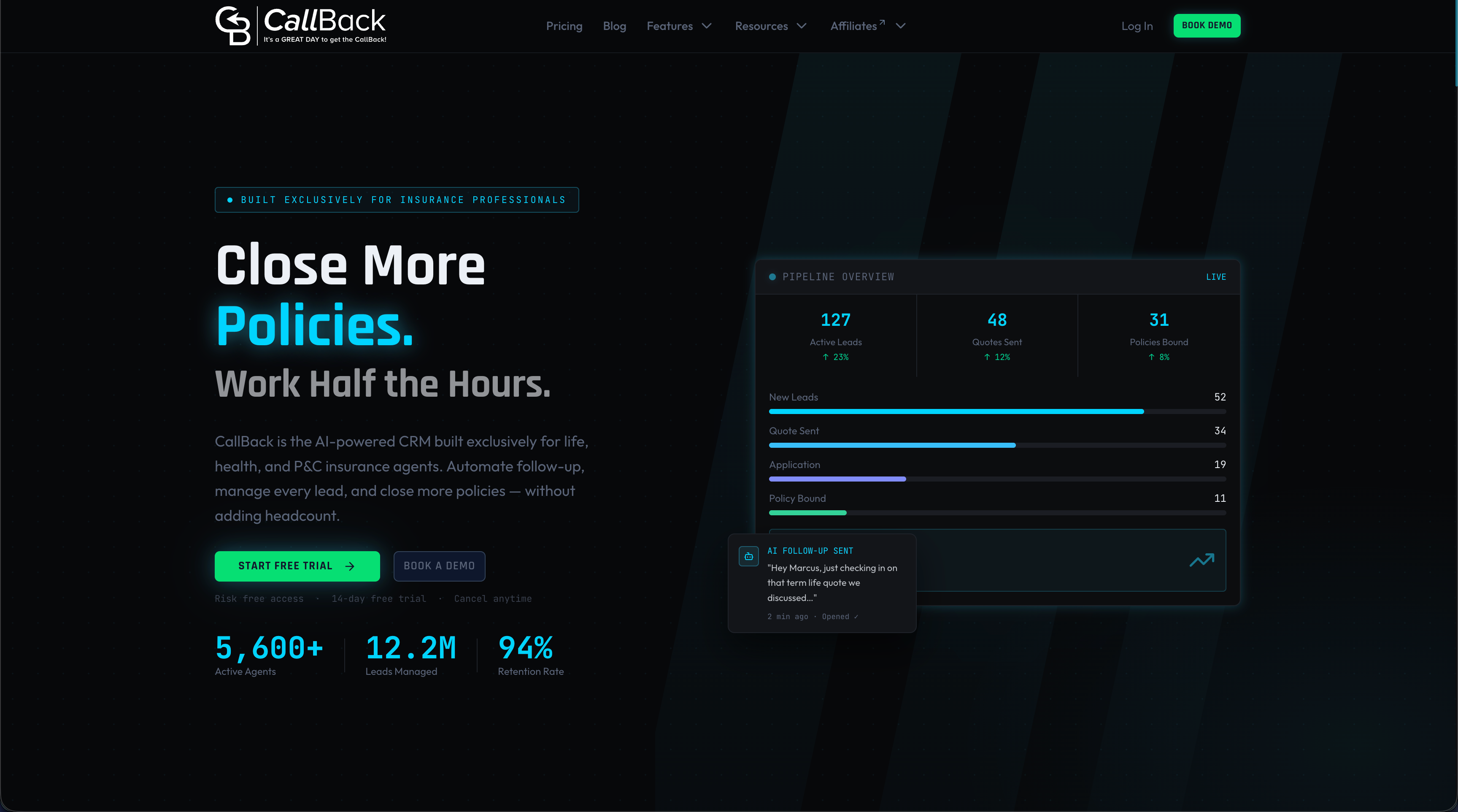
The platform’s SMS marketing and automation features capture customer touchpoints directly into the record, feeding retention and renewal tracking without extra data entry. Reporting connectors export clean, structured events so whatever dashboard tool your team already uses gets reliable inputs instead of guesswork stitched together from three disconnected systems. If your current setup for managing CRM data for insurance agents leaves gaps in producer attribution or lead source tracking, that’s usually the first place a dashboard breaks. Visit the SMS features page to see how the capture layer works, or start a trial to see your own funnel events flow into structured data within the first week.
Where to Go for KPI Formulas, Benchmarks, and Templates
For deeper formula references, consult VCA Software’s insurance KPI guide for definitions and segmentation practices, KPI Depot’s benchmark library for percentile benchmarks, and the FP&A Professional Institute’s primer for cadence guidance tied to metric volatility. Each covers formulas, targets, and downloadable reference material worth bookmarking. Retention-specific tactics are covered well by this guide on customer retention strategies, which offers practical measurement approaches worth pairing with your renewal KPIs.
Sources
A dashboard is only as trustworthy as the systems feeding it. Five sources typically need to connect: policy administration, claims management, billing and finance, the CRM, and distribution or producer systems. External benchmark data rounds out the picture when you need percentile comparisons rather than absolute targets.
Two integration patterns dominate. Nightly ETL batches work fine for financial and underwriting KPIs that don’t need to update by the minute. Event-driven streaming fits claims operations and lead-to-bind tracking, where a delay of hours means a manager is reacting to yesterday’s problem. Most mature setups run both: batch for the stable ratios, streaming for anything operational.
Common data problems show up the same way across most carriers and agencies:
- Insurance KPIs: Metrics That Matter for Claims, Underwriting, and Profitability
- 15 Insurance Industry KPIs Explained - FP&A Professional Institute
- 12 Most Important Insurance KPIs to Track (2026) | KPI Depot
- Insurance Performance Dashboard (community example)
Fixes are unglamorous but effective: canonical policy keys, a reconciliation pipeline that runs before reports publish, and a documented data dictionary everyone references. Real-time dashboards that combine policy, claims, accounting, and reinsurance data let teams drill from an enterprise summary down to portfolio or agent level, but only when the underlying keys reconcile cleanly. Governance rounds it out: assign an owner for each KPI formula, version the formula when it changes, and require approval before anyone edits a target.