

This guide delivers 10 annotated insurance landing page examples, a step-by-step launch checklist, and the exact tests to run first. Here is what you will find:
- What to copy from each example: headline formula, CTA and form pattern, and the trust signal doing the heaviest lifting.
- Top design pattern to reuse: the micro-commitment opener that reduces form abandonment across auto, life, and health pages.
- First A/B test to run: headline savings number versus a friction-reducing statement, with a 14-day measurement plan.
The annotated examples start in the next section. The Callbackcrm automation workflow for wiring these pages into a follow-up funnel appears in the EEAT section near the end.
Key Takeaways
The most effective insurance landing pages combine a single declared goal, a micro-commitment form opener, numeric proof in the hero, and automated follow-up wired directly to the CRM.
| Point | Details |
|---|---|
| Single page goal | Remove navigation and competing CTAs; one page, one conversion action. |
| Micro-commitment opener | Start with ZIP or policy type only; reveal qualification fields after the first step. |
| Show numbers before identity | Display savings figures, client counts, or rate ranges before asking for personal data. |
| Observed conversion range | Insurance landing pages convert at approximately 10%–17% depending on product and traffic source. |
| Callbackcrm automation | Callbackcrm wires form submissions into immediate SMS, email, and priority call routing for insurance agents. |
Table of Contents
- What makes a high-performing insurance landing page convert?
- 10 insurance landing page examples you can copy right now
- What every insurance landing page needs: a build checklist
- Design and microcopy patterns you can drop into any template
- How to adapt your page structure by insurance product type
- What to test, which metrics matter, and realistic benchmarks
- Builders, integrations, and ready templates: which to use when
- How Callbackcrm builds landing pages that feed automated funnels
- A seven-step checklist to go from brief to live
- Legal and regulatory compliance on insurance landing pages
- How to handle the objections visitors bring to insurance pages
- Accessibility standards for insurance landing pages
- Callbackcrm turns landing pages into automated lead funnels
- Three things to test first on your next insurance landing page
- Research links and templates to explore next
- Sources
What makes a high-performing insurance landing page convert?
Every strong insurance landing page starts with one declared goal. Quote, appointment, phone call, or lead magnet — pick one and remove every navigation link that pulls visitors away from it. Pages that try to do two things at once typically do neither well.
The core mechanics break down into five areas:
- Single-minded page goal: strip the header nav, keep one primary CTA, and make the offer explicit in the first five words of the headline.
- Progressive micro-commitments: open with a ZIP code or policy type selector, then reveal the next qualification fields only after the visitor commits to step one. Simpler hero forms act as effective micro-commitments that increase completion rates versus full multi-field hero forms.
- Hero-level proof: show a savings figure, number of clients served, or star rating before asking for any personal information. Pages that present potential savings or quotes before asking for personal details reduce abandonment.
- Mobile-first affordances: sticky CTAs, large tappable buttons, and a one-field opener that works on a 375px screen without horizontal scrolling.
- Trust signals that reduce friction: transparent pricing, customer reviews, and professional site design are consistently cited as top factors that help consumers trust a business, according to Statista.
Pro Tip: Remove the global navigation bar entirely on campaign landing pages. Every extra link is an exit door. Insurance pages with stripped navigation consistently outperform full-site pages for paid traffic.
Benchmark context: observed campaign conversion rates for insurance landing pages range from approximately 10% to 17%, depending on product type and traffic source. Auto insurance pages driven by branded PPC tend to sit at the higher end; life insurance pages relying on cold display traffic often sit lower.
10 insurance landing page examples you can copy right now
The following examples cover major U.S. carriers, a health marketplace, and one agency-style pattern. Each entry includes the page goal, primary CTA, form approach, trust signals, and concrete items to copy into your own brief.
1. GEICO: savings-first auto quote
Page goal: auto insurance quote. Primary CTA: “Get a free auto insurance quote.” Form: ZIP code opener, then vehicle and driver details in a multi-step flow.
GEICO leads with a specific savings claim in the hero, then gates the full form behind that first ZIP entry. The brand name itself functions as a trust signal, but the page reinforces it with a prominent star rating and a count of customers served.
What to steal:
- Open with a dollar-figure savings claim in the headline, not a generic “save on insurance” statement.
- Use a ZIP-only first step to lower perceived commitment before asking for vehicle details.
- Place the star rating directly below the CTA button, not in a separate testimonials section.
2. Progressive: life insurance partner flow
Page goal: life insurance quote via partner marketplace. Primary CTA: “Get a life insurance quote.” Form: quick quote flow with term length and coverage estimate questions early.
Progressive’s life insurance pages demonstrate a price-first lead prompt supported by a partner marketplace. The page surfaces affordability language (“coverage starting at”) before asking for identity details, which reduces the friction that typically stalls life insurance leads.
What to steal:
- Lead with an affordability anchor (“coverage starting at $X/month”) even when the final price depends on underwriting.
- Ask term length and coverage amount before name and email — qualification before identity.
- Include a partner-sourced trust strip showing carrier logos to signal choice without requiring the visitor to leave.
3. Blue Cross Blue Shield: network and eligibility health page
Page goal: health plan enrollment or quote. Primary CTA: “Find a plan.” Form: ZIP plus plan type selector, then eligibility questions.
Blue Cross Blue Shield pages prioritize network access language over price. The hero typically highlights the number of in-network providers or hospitals, which addresses the primary health insurance objection (“Will my doctor be covered?”) before the visitor reaches the form.
What to steal:
- Lead with a network size figure (“X,000+ in-network providers”) rather than a premium estimate.
- Use privacy-aware microcopy near the form (“Your information is secure and never sold”).
- Include a quick eligibility check as the first form step to segment ACA, employer, and Medicare leads before routing them.
4. Allstate: bundling and multi-product page
Page goal: multi-line quote (auto + home bundle). Primary CTA: “Get a quote.” Form: product selector (auto, home, both), then ZIP.
Allstate’s bundling pages lead with a savings percentage tied to combining policies. The product selector at the top of the form acts as a segmentation tool, routing visitors into different qualification flows without requiring a separate page per product.
What to steal:
- Use a product-type selector as the first form element to segment intent before collecting any personal data.
- Show the bundle discount as a percentage in the hero (“save up to X% when you bundle”).
- Place agent availability language (“talk to a local agent”) as a secondary CTA for visitors who want a human touchpoint.
5. Amica: trust-first, ratings-led page
Page goal: quote or contact. Primary CTA: “Get a quote” or “Contact us.” Form: short contact form with policy type selector.
Amica’s pages lean heavily on third-party ratings (J.D. Power, AM Best) rather than savings claims. This approach works because Amica’s audience skews toward buyers who prioritize service quality over price. The page design is clean and low-density, which signals stability rather than urgency.
What to steal:
- When your brand’s differentiator is service quality, lead with a named third-party rating rather than a price claim.
- Keep the form short (3–4 fields) and position it above the fold on desktop.
- Use a muted color palette to signal trust and stability rather than urgency.
6. Aflac: supplemental insurance education-first page
Page goal: lead capture or employer inquiry. Primary CTA: “Get a quote” or “Learn more.” Form: employer size and contact details.
Aflac’s supplemental insurance pages face a unique challenge: most visitors do not fully understand the product before they arrive. The page addresses this with a short “how it works” section above the form, which reduces the objection “I don’t know if I need this” before asking for contact details.
What to steal:
- For products with low consumer awareness, place a three-step “how it works” module above the form.
- Use employer-size segmentation in the form to route small-business and enterprise leads differently.
- Include a short FAQ section on the page itself to handle the top two objections without requiring a phone call.
7. Allianz: travel insurance urgency page
Page goal: travel policy quote. Primary CTA: “Get a quote.” Form: trip dates, destination, and traveler count.
Allianz travel insurance pages work because they match the visitor’s urgency. Someone booking a trip wants coverage quickly. The page leads with departure date and destination fields, which signals “this will take 60 seconds” and matches the visitor’s mental model of the task.
What to steal:
- Match the form fields to the visitor’s current task (booking a trip), not to your internal data model.
- Highlight emergency assistance and medical evacuation coverage in the hero — these are the highest-anxiety benefits for travel buyers.
- Use a trip-cost field to anchor the value of coverage against the cost of the trip.
8. State Farm: local agent + quote hybrid page
Page goal: quote start or agent contact. Primary CTA: “Start a quote” or “Find an agent.” Form: ZIP-based agent finder or quote flow.
State Farm’s campaign pages place quote-start flows and savings language prominently in the hero, then offer a secondary path to a local agent. This dual-CTA approach captures both high-intent self-service visitors and lower-intent visitors who want a human conversation.
What to steal:
- Offer two CTAs with clear hierarchy: primary (quote) and secondary (find an agent), visually differentiated by button style.
- Use ZIP-based routing to personalize the follow-up with a local agent’s name and photo.
- Include a savings claim in the hero even when the primary differentiator is local service.
9. Credit Karma: comparison and transparency page
Page goal: insurance comparison lead. Primary CTA: “Compare rates.” Form: ZIP, age, and vehicle type.
Credit Karma’s insurance pages lead with a comparison frame rather than a single-carrier pitch. Surfacing premium comparisons and savings estimates before asking for identity reduces friction and improves visitor confidence. The page positions the platform as a neutral advisor, which lowers the guard of visitors who distrust direct-carrier pages.
What to steal:
- Use a “compare X carriers” headline to signal choice and neutrality.
- Show a sample comparison table or rate range in the hero before the form to demonstrate value upfront.
- Frame the form as “check your rate” rather than “get a quote” to reduce perceived commitment.
10. Agency/broker exemplar: the micro-commitment quiz page
Page goal: qualified lead capture. Primary CTA: “Find my coverage.” Form: quiz-style progressive flow (3–5 questions, one per screen).
This pattern, documented across Unbounce’s insurance landing page examples and Landingi’s roundup, reframes the form as a personalized coverage assessment. Each question screen shows a progress bar, which increases completion rates by making the end feel close. The final screen collects contact details after the visitor has already invested time in the quiz.
What to steal:
- Reframe the form as a “coverage check” or “find my plan” quiz rather than a data-collection form.
- Show a progress bar on every question screen.
- Collect name and email on the last screen only, after the visitor has answered qualification questions.
Pro Tip: The Unbounce Bright Insurance template is a practical starting point for campaign pages that need quick deployment. It is built for lead generation and includes a pre-configured form and trust strip.
What every insurance landing page needs: a build checklist
A strong page includes these elements. Use this list as a pre-launch review.
Must-have elements:
- Headline that quantifies value or reduces friction (“Get a free life quote in 60 seconds” or “See your rate — no commitment”)
- Reinforcing subhead that names the product and the primary benefit
- Hero CTA button with action-specific label (not just “Submit”)
- Micro-form opener (ZIP, email, or policy type — one field maximum in the hero)
- Progressive qualification flow that reveals additional fields after the first commitment
- Trust strip with logos, ratings, or a client count placed near the form
- Short policy/disclosure link (required by state insurance regulations — see the compliance section)
- Benefit-first bullet list (three to five items, each starting with the outcome, not the feature)
- Secondary CTA for lower-intent visitors (“Talk to an agent” or “Learn how it works”)
What to avoid:
- Hidden pricing or vague “call for a quote” language when a rate estimate is possible
- Long multi-field hero forms (more than three fields above the fold)
- Generic stock photography that does not reflect the target audience
- Navigation links that pull visitors off the page before they convert
- Testimonials without a name, location, or policy type (anonymous quotes carry little weight)
Copy formulas that work:
- Headline: “Get [product] coverage in [time] — no [friction point].”
- CTA: “See my rate” / “Find my plan” / “Check my coverage.”
- Trust microcopy: “Trusted by [number] customers” / “Rated [X] stars by [source].”
Pro Tip: AI-assisted landing-page tools can accelerate copy generation and A/B variant creation. Use them to produce three headline variants in the time it would normally take to write one, then test them against each other in the first two weeks.
Design and microcopy patterns you can drop into any template
Three hero module patterns cover most insurance use cases:
Numbers-first hero: lead with a savings figure or client count in large type, then the headline, then the form. Works best for auto and home insurance where price is the primary decision driver.
Empathy-first hero: lead with a short statement that names the visitor’s concern (“Worried about leaving your family without income?”), then the benefit, then the form. Works best for life and disability insurance where emotional stakes are high.
Calculator/selector hero: lead with an interactive element (premium estimator, coverage selector, or quiz opener) that delivers immediate value before asking for contact details. Works best for health and business insurance where product complexity is high.
Form microcopy patterns:
- ZIP opener placeholder: “Enter your ZIP to see local rates” (not just “ZIP code”)
- Slider-based estimate: “Move the slider to see how coverage amount affects your monthly cost”
- Quiz opener: “Answer 3 quick questions to find the right plan”
- Privacy microcopy below the form: “We never sell your information. No spam, ever.”
Before/after microcopy swaps:
- Headline: “Get insurance today” → “See your auto rate in 90 seconds”
- CTA: “Submit” → “Find my rate”
- Form label: “Personal information” → “Your coverage check”
Accessibility and mobile notes:
- Form labels must be visible at all times, not just as placeholder text that disappears on focus.
- Tappable targets (buttons, radio buttons, checkboxes) should be at least 44px tall on mobile.
- Error messages should name the field and suggest a fix (“Please enter a valid ZIP code — 5 digits only”), not just flag the error.
- Color contrast for body text should meet WCAG 2.1 AA (4.5:1 ratio minimum) so the page is readable for users with low vision.
How to adapt your page structure by insurance product type
The same core template works across product lines, but the primary objection, proof point, and form fields differ by product.
Auto insurance leads with savings and bundling incentives. The ZIP plus date of birth plus vehicle year opener is the industry standard because it enables an instant rate estimate. Include a direct phone number or click-to-call button for high-intent PPC traffic — these visitors often want to speak to someone immediately.
Life insurance requires benefit framing before price. Visitors are thinking about their family’s financial security, not their monthly premium. Lead with the outcome (“Your family stays financially protected”) and introduce affordability language (“coverage from $X/month”) as a secondary point. Ask term length and coverage amount before name and email in the qualification flow. Human testimonials that reference family outcomes outperform generic reviews on life insurance pages.
Health insurance pages must address network access and provider availability first. Include a quick eligibility check as the first form step to segment ACA marketplace, employer-sponsored, and Medicare leads. Use privacy-aware language near the form, and consult your legal team on HIPAA-compliant data handling language before launch.
Travel insurance pages benefit from urgency framing tied to the trip itself. Match the form fields to the booking task (departure date, destination, trip cost) and highlight emergency medical and evacuation coverage in the hero. A low-friction quote path (three fields maximum) works well here because the purchase decision is often made in a single session.
Business and commercial insurance pages require longer qualification flows, but those flows should be clearly sectioned (industry, employee count, coverage type) so the visitor can see progress. Use industry-specific trust signals: carrier partnership logos, broker license numbers, and anonymized case studies showing coverage outcomes for similar businesses.
Pro Tip: For life insurance landing pages, test an education-first page (how term life works + calculator) against a price-first page (coverage from $X/month + short form). Education-first pages often produce fewer but better-qualified leads, which matters more when the sales cycle is long.
What to test, which metrics matter, and realistic benchmarks
Start with these primary metrics before adding complexity:
- Conversion rate (quote requests or leads divided by unique visitors) — the primary KPI for every insurance landing page.
- Hero CTA click-through rate — measures headline and offer clarity before the form is even reached.
- Form abandonment rate — the gap between form starts and form completions; high abandonment usually points to form length or a trust problem.
- Cost per lead — ties page performance to media spend and makes optimization decisions financially concrete.
- Lead-to-appointment rate — available when CRM data is wired back to the page; shows whether the page is attracting qualified visitors or just volume.
Prioritized A/B tests (run in this order):
- Test 1: Headline savings number versus a friction-reducing statement (“Save $X on auto” vs. “See your rate in 60 seconds — no commitment”). Run for 14 days minimum.
- Test 2: Short-form opener (ZIP only) versus full-form hero (ZIP + DOB + vehicle). Expect a meaningful difference in completion rate.
- Test 3: Trust strip placement — directly below the hero CTA versus below the form.
- Test 4: CTA wording and color — “Get my quote” versus “See my rate” versus “Find my plan.”
- Test 5: Social proof type — star rating with review count versus a named testimonial with policy type.
Observed campaign conversion rates for insurance landing pages range from approximately 10% to 17%, per Perspective’s published examples. Pages with quiz-style micro-commitment flows tend to sit at the higher end of that range.
Tracking wiring: push these events to your analytics platform and CRM on every page: form start, form field completion (step-by-step for multi-step forms), form submit, phone click, and quote request ID. Deduplicate leads across channels by matching on phone number or email at the CRM level before routing to an agent. This prevents the same lead from receiving multiple simultaneous outreach attempts, which damages trust.
Builders, integrations, and ready templates: which to use when
Three tool categories cover most insurance landing-page needs. The right choice depends on speed, control, and measurement requirements.
| Tool category | Best for | Speed to launch | A/B testing | CRM integration |
|---|---|---|---|---|
| Visual landing-page builder | Campaign pages, paid traffic, rapid iteration | Fast (hours to days) | Built-in | API or native connector |
| Agency or pre-built template | Single-product launches, limited dev resources | Medium (days) | Requires builder | Manual or webhook |
| In-house dev template | Brand-controlled, high-volume, complex compliance | Slow (weeks) | Custom implementation | Direct CRM API |
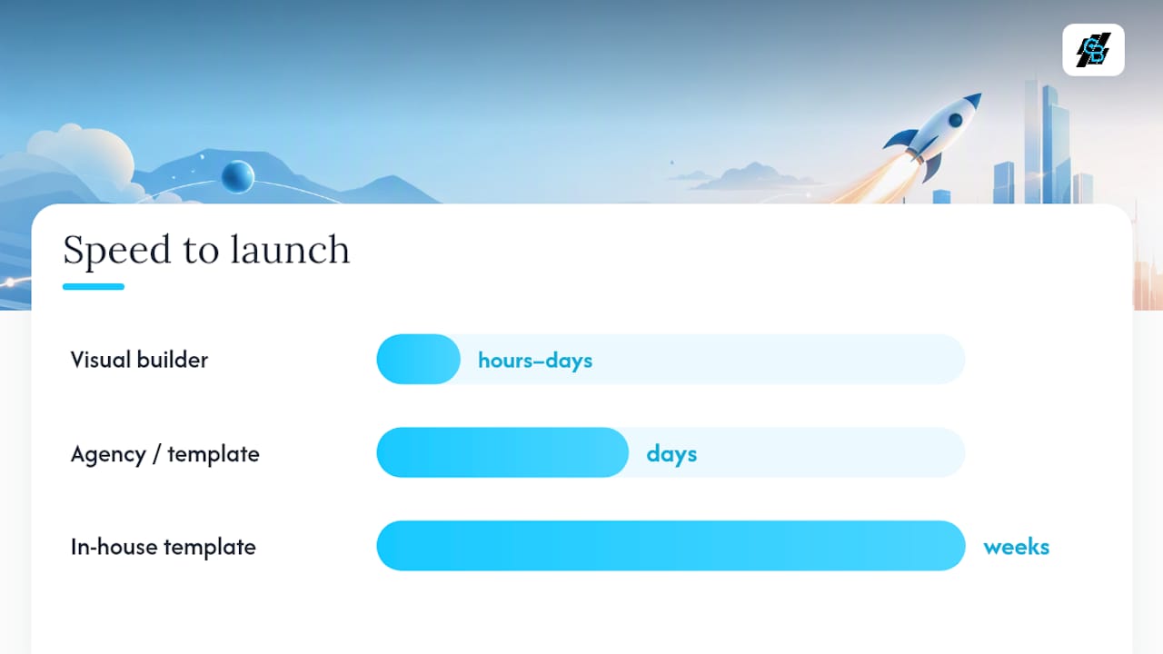
Visual builders with built-in A/B testing are the right choice for most paid campaigns. They allow rapid iteration without developer involvement, which matters when a test needs to go live within 24 hours of a media buy. Landingi’s examples roundup highlights that simplified messaging and template-led workflows speed production, and that AI tools increasingly accelerate landing-page builds and optimization.
Integration tips for Callbackcrm:
- Push form payloads (all field values plus UTM parameters) to Callbackcrm on form submit.
- Send phone click events as a separate CRM event tagged “high-intent” for priority routing.
- Pass the quote request ID as a custom field so agents can reference the specific inquiry in their first outreach.
- Use UTM source and medium to segment leads by channel in the CRM, enabling channel-specific nurture sequences.
When to use a template versus a custom page: use a template when campaign volume is low, the product is standard, and compliance requirements are straightforward. Build a custom page when the product requires complex disclosure language, the audience requires significant personalization, or the page will receive enough traffic to justify the development cost.
Pro Tip: Optimizing landing-page metadata (title tag, meta description, canonical URL) matters for organic traffic even on campaign pages. A page that ranks organically reduces cost per lead over time.
How Callbackcrm builds landing pages that feed automated funnels
The workflow that produces consistent results follows a clear sequence: campaign brief → single-purpose landing page → tracking and CRM wiring → automated lead scoring and multi-channel follow-up (SMS, email, voicemail) → nurture workflows for partially completed forms.
Automation templates Callbackcrm uses:
- Immediate response sequence: within 90 seconds of form submit, the lead receives a short SMS confirming receipt and offering a direct booking link. A follow-up email with the quote summary or next steps goes out within five minutes. A scheduled advisor call is booked automatically if the lead clicks the calendar link.
- 48-hour micro-commitment sequence for partial form completions: if a visitor starts the form but does not submit, a remarketing pixel fires and a CRM event is logged. A two-message SMS sequence over 48 hours invites the visitor to complete their coverage check, with a direct link back to the partially completed form.
- High-intent phone-click routing: visitors who click a phone number on the page are tagged as high-intent in the CRM and routed to a priority call queue. These leads receive a callback within minutes rather than hours.
The key change was treating form starts as CRM events, not just form submits, which enabled the 48-hour re-engagement sequence to recover leads that would otherwise have been lost.
Routing phone-click leads to a prioritized rapid-call workflow is the single highest-ROI automation an insurance agency can implement. A lead who clicked to call is already past the consideration stage — every minute of delay reduces close probability.
Pro Tip: Wire your lead generation workflow so that form starts trigger a CRM event immediately, not just form submits. This enables re-engagement sequences for the visitors who showed intent but did not complete the form.
A seven-step checklist to go from brief to live
Follow these steps in order to launch a page that is ready to test within two weeks.
- Define the single page goal and offer. Write one sentence: “This page exists to generate [quote/appointment/phone call] for [product] from [audience segment].” If you cannot write that sentence, the brief is not ready.
- Map required disclosures. Identify state-specific licensing disclosures, rate disclaimer language, and any TCPA consent language required for SMS follow-up. Flag these for legal review before design begins.
- Choose your template or builder. Select based on the tool-category table above. Confirm CRM integration is available before committing to a builder.
- Wireframe the hero and form. Sketch the above-the-fold layout: headline, subhead, hero image or proof element, CTA button, and micro-form opener. Keep the wireframe to one page.
- Implement tracking and CRM wiring. Set up form-start, form-submit, and phone-click events before launch. Confirm UTM parameters pass through to the CRM.
- Launch paid or organic traffic. Start with a single channel (usually paid search) to isolate page performance from traffic-mix variables.
- Run the prioritized A/B test for 14 days. Start with the headline test (savings number vs. friction-reducing statement). Do not change anything else during the test period.
Two-week test plan:
- Days 1–7: monitor conversion rate, hero CTA CTR, and form abandonment daily. Flag anomalies (CTR below 2% on the hero CTA suggests a headline problem; abandonment above 60% suggests a form-length problem).
- Day 7: if one variant is clearly underperforming (less than half the conversion rate of the other), end the test early and implement the winner.
- Days 8–14: run the second test (form length) while the winning headline is live.
Brief fields to capture before design starts:
- Page goal and primary KPI
- Target audience segment (age, product, channel)
- Top three objections to address on the page
- Must-have trust signals (ratings, carrier logos, client count)
- Required disclosures and legal review deadline
Legal and regulatory compliance on insurance landing pages
Insurance landing pages in the United States operate under several overlapping regulatory requirements. State insurance departments require that licensed agents and agencies display their license numbers on consumer-facing pages. Rate disclaimer language (“rates vary by state, driving record, and coverage selection”) is required when any specific rate or savings figure appears on the page.
TCPA (Telephone Consumer Protection Act) consent language is required before collecting a phone number for SMS or automated call follow-up. The consent statement must be clear, specific, and not buried in fine print. Consult your legal team on the exact wording, as TCPA enforcement has been active in the insurance sector.
For health insurance pages, CMS (Centers for Medicare and Medicaid Services) has specific rules about how Medicare Advantage and ACA marketplace plans are marketed. Pages targeting Medicare beneficiaries must follow CMS marketing guidelines, which restrict certain claims and require specific disclaimers. This is a specialized compliance area — work with a compliance attorney before launching Medicare-focused pages.
Privacy policy and terms of service links must be visible on every page that collects personal data. Place them in the footer and near the form submit button. For pages using cookies or tracking pixels for remarketing, a cookie consent notice may be required depending on the states you are targeting and the data privacy laws that apply (California’s CPRA, for example, has specific requirements for insurance data).
This section covers general principles. Confirm current requirements with a licensed insurance compliance attorney before launch.
How to handle the objections visitors bring to insurance pages
Insurance visitors arrive with predictable concerns. Addressing them on the page reduces the need for a phone call to overcome them.

“I don’t want to be spammed.” Place a one-line privacy statement directly below the form submit button: “We never sell your information. No spam, ever.” This single line reduces form abandonment on pages where it has been tested.
“I don’t know if I need this product.” Use a short “how it works” or “is this right for me?” module above the form for products with low consumer awareness (supplemental insurance, travel insurance, business liability). Three bullet points covering the most common use cases are enough.
“I don’t trust this company.” Third-party ratings (J.D. Power, AM Best, BBB) carry more weight than self-reported claims. Place the rating logo and score near the form, not in a separate testimonials section at the bottom of the page.
“The price will be too high.” Show a rate range or a “coverage starting at” figure in the hero. Visitors who see a price anchor before the form are less likely to abandon when the actual quote is revealed. Surfacing premium comparisons before asking for identity reduces friction and improves confidence.
“This will take too long.” State the time commitment in the headline or subhead: “Get a quote in 60 seconds” or “3 questions to find your plan.” Progress bars on multi-step forms reinforce this promise.
“I’d rather talk to a person.” Include a secondary CTA with a phone number or live chat option. Some visitors will not convert on a form regardless of how well it is designed. A visible phone number captures this segment without competing with the primary CTA.
Accessibility standards for insurance landing pages
WCAG 2.1 AA is the standard that most U.S. organizations target for web accessibility. For insurance landing pages, the most common gaps are in form design, color contrast, and keyboard navigation.
Color contrast: body text must meet a 4.5:1 contrast ratio against its background. CTA buttons must meet 3:1 for large text. Use a tool like the WebAIM Contrast Checker to verify before launch.
Form accessibility: every form field must have a visible label that is programmatically associated with the input (not just placeholder text). Error messages must be descriptive and linked to the specific field that caused the error. Required fields must be marked with both a visual indicator and an accessible label (not color alone).
Keyboard navigation: all interactive elements (buttons, form fields, links) must be reachable and operable via keyboard. Tab order should follow the visual reading order of the page. Focus states must be visible.
Images and media: hero images must have descriptive alt text. Decorative images should have empty alt attributes so screen readers skip them. If the page includes a video, captions are required.
Mobile accessibility: touch targets must be at least 44x44 pixels. Pinch-to-zoom must not be disabled. Font sizes should not be set below 16px for body text on mobile.
Section 508 of the Rehabilitation Act applies to federal agencies and their contractors. If your agency works with federal programs (Medicare, Medicaid, CHIP), Section 508 compliance is a requirement, not a recommendation. Confirm the specific scope with your compliance team.
Callbackcrm turns landing pages into automated lead funnels
Building a high-converting page is only half the job. What happens in the first 90 minutes after a lead submits a form determines whether that lead becomes an appointment.
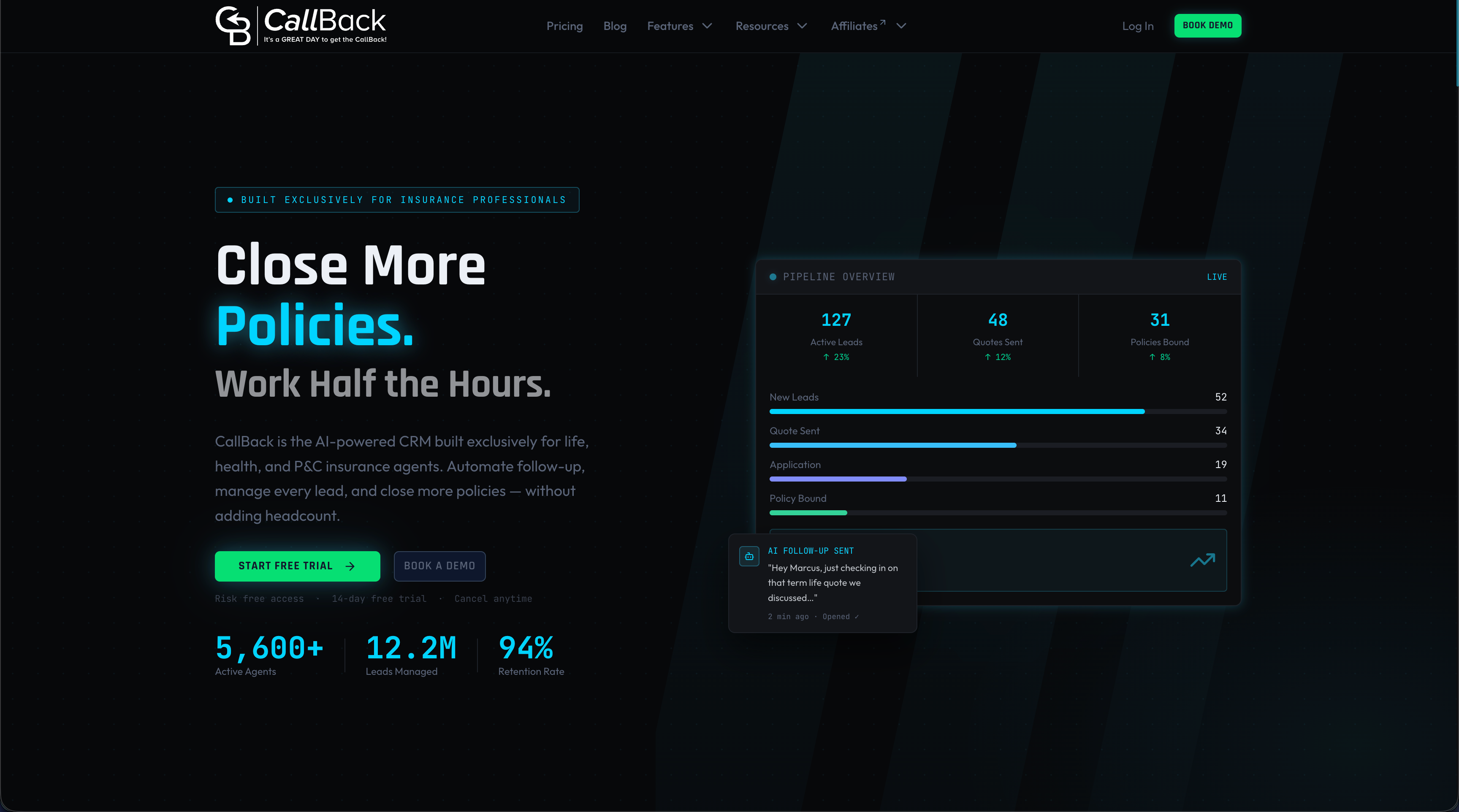
Callbackcrm connects directly to your landing pages and automates the follow-up sequence that most agencies handle manually or miss entirely. Form submissions trigger an immediate SMS, a follow-up email, and a calendar booking link without any manual intervention. Phone clicks are tagged as high-intent and routed to a priority call queue. Partial form completions become remarketing events that feed a 48-hour re-engagement sequence. The platform handles SMS marketing and automation, lead scoring, and multi-channel follow-up from a single dashboard, so agents spend time on qualified conversations rather than chasing cold leads.
Other tools handle pieces of this workflow. Callbackcrm is built specifically for insurance agents and agencies who need the entire funnel, from landing-page lead capture to booked appointment, running without manual steps. Start a free trial at Callbackcrm to see the automation templates in action.
Three things to test first on your next insurance landing page
The headline is the highest-leverage test on any insurance page. A savings-number headline (“Save up to $X on auto insurance”) works well for price-sensitive PPC traffic. A friction-reducing headline (“See your rate in 60 seconds — no commitment”) works better for audiences who have been burned by aggressive insurance sales tactics. Test both before assuming one is right for your audience.
The second test is form length. A ZIP-only opener consistently outperforms a three-field hero form in first-step completion rate. The tradeoff is lead quality: a longer form pre-qualifies visitors, which can reduce the volume of unqualified leads reaching agents. The right answer depends on your cost per lead tolerance and your agents’ capacity to handle volume versus quality.
Trust-strip placement is the third test most teams skip. Placing the trust strip (ratings, logos, client count) directly below the CTA button, rather than below the form or at the bottom of the page, tends to improve conversion on pages where brand recognition is low. For well-known carriers, the brand name itself provides enough trust that the strip placement matters less.
On product type: education-first pages (how it works, calculator, FAQ) outperform price-first pages for life and disability insurance, where the purchase decision takes longer and the visitor needs to understand the product before they are ready to quote. For auto and travel insurance, price-first pages win because the visitor already understands the product and wants a number.
One note on legal limits: disclosure and consent language is not optional, and it cannot be reduced to a single checkbox buried below the fold. If your compliance team flags a required disclosure, design around it rather than minimizing it. A page that converts well but generates TCPA complaints is not a high-performing page.
Research links and templates to explore next
The following sources were used as background for this guide. Links marked as templates are ready to use as starting points for campaign pages.
- 10 insurance landing page examples — Unbounce — research article with annotated examples and form-design patterns.
- Bright Insurance lead generation template — Unbounce — template to reuse for quick campaign deployment.
- 8 insurance landing pages you can copy — Perspective — research article with observed conversion rate ranges (10%–17%).
- Insurance price comparison template — Rocket — template to reuse for transparency-driven comparison pages.
- 20 insurance landing page examples — Landingi — research article covering AI-assisted builds and simplified messaging patterns.
- Consumer trust factors — Statista — research data on pricing transparency, reviews, and design as trust drivers.
- Lead nurturing strategies — partner article on multi-step nurturing and re-engagement sequences.
- Insurance funnel optimization guide — Callbackcrm — in-depth automation and funnel tactics for insurance teams.
- How to generate insurance leads that convert — Callbackcrm — step-by-step lead generation playbook for insurance funnels.
Sources
- Statista — Factors that help consumers trust a business (U.S.)
- 10 insurance landing page examples to generate quality leads — Unbounce
- 8 Insurance Landing Pages You Can Copy in 2026 | Perspective
- Insurance Price Comparison Website Template | Rocket
- Bright Insurance lead generation - landing page template by Unbounce